Most of the time I prefer to do my mockups on a whiteboard. Mocking up a UI on a whiteboard has several advantages. First, the client knows that it's not the real UI. It's amazing, to me anyway, how important that really is. The minute you have something that looks real, you start focusing the details of the interface. Early on, when the mock up is most useful, you don't want to spend much time worrying about the particular details -- how many pixels away from this input element the text is or the exact color of that background.
I find that it's helpful to draw a picture of how the interface might work when trying to explain my ideas of how it could work. My feeling is that making the UI mockup too real at this point runs the risk of changing the focus from the function of the application to the look of the application. Now, there are aspects of the interface that both strongly affect functionality and are driven by it. For example, drop down lists are excellent ways to present a small number of fixed choices to a user, but fixating on a drop down list can drive the design of the interface in ways that may not be appropriate if the number of potential inputs is very large. Knowing what you need to accomplish at this point is much more important that deciding how you are going to accomplish it. Conversely, once you know the parameters of what you are trying to accomplish, some of the UI interface components are constrained.
Second, I know that it's not the real interface. You may not have this problem, but I tend to be a perfectionist. For me, using a tool holds the temptation for me to start fixating on the details of the interface. I start worrying about the color scheme -- trying various combinations and shadings to get just the right look -- or spending time getting this particular element to line up with that one or center under another. Now there is a time to focus on that, assuming that it's important to the customer, but mock up time is probably not the time for this. I'd really prefer to get a version or two in front of the customer to use before I start spending a lot of time trying to perfect the look and feel.
Because I follow an agile philosophy, I expect that feedback on the early versions will drive the functionality and the interface in ways that we may not have expected when conceiving the initial application requirements. The further we get into development, the more stable the interface will, or should, become. Once the interface has stabilized it makes more sense to spend effort on getting the look and feel perfected. That's not to say that significant effort doesn't go into developing the interface, but I prefer that it be done as I'm developing the actual interface not the mock up. I prefer to use the mock up as a design guideline, not a finished product that needs to simply be translated into the application.
In addition, I really like the extremely low cost of using a whiteboard. I don't have to worry about access to the computer on my desk with the application. I don't have to spend a lot of time in advance preparing different versions, anticipating the possible the directions the feature discussion will take.
Unfortunately, there's one or two very big disadvantages to the whiteboard: it's hard to keep the artifacts you develop there in a format that is both permanent and modifiable. This is especially true if the whiteboard is not in your office. I often take pictures of the whiteboard and store them in my development wiki along with my stories, but I can only refer back to these. If I want to make changes, I need to redraw the mock up each time, take a picture, and store it. It's also very difficult to share a whiteboard, at least, a plain, ol' whiteboard, such as the ones we have in our office, with people who aren't in the same building.
I recently ran into a problem along this line with the jQuery slideshow I wrote about earlier. I wasn't happy with the location of my slideshow controls: centered over the top of the image. Whenever the image orientation or size change in the slideshow, the controls would move on the page. It was disconcerting to say the least. Rather than change the actual interface, I decided to mock up some alternatives to see how it would work visually before committing to changing code.
I could have done this on a whiteboard and, in the past, I probably would have. I decided to try out a new tool, however, that I had found out about on StackOverflow. That tool is Balsamiq Mockups from Balsamlq Studios. Balsamiq Mockups basically allows you to sketch out a user interface in a way that mimics a hand-drawn interface. You can save the interface, open it up again later, and modify it if you want. Balsamiq has versions of their tool for Confluence, Jira, and xWiki, as well as a desktop version.
I decided to download a copy of their desktop version and draw up my interface. Unfortunately, the trial version didn't include the ability to save and I didn't make a screenshot, but I was really pleased with how quickly I was able to mock up a look alike to the existing interface and make my control changes. Once I did I was able to see that the controls, now anchored in a 2x3 block on the upper left of the images, worked well visually. I went ahead with the changes and, more to the point, decided to convince my manager to try the version for Confluence, which I also use as a permanent extension of my development practices. I have a lot of hopes for Balsamiq Mockups. It seems to encompass the best features of hand-drawn mock ups - we can focus on the elements, not the details and there's not a lot of investment/cost to developing them -- and allows me to save and share them for later use.
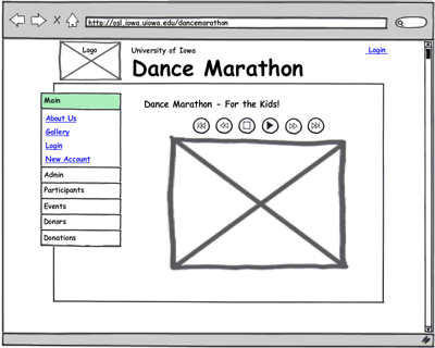
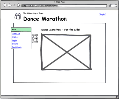
Below are a couple of mock ups developed with the trial version of the tool for Confluence. Neither of these took more than a few minutes to work up. They are embedded in the wiki with my development stories and available to the customer from the web. Notice how in the second mock up, I've replaced the image placeholder in the header with one of the standard icons. You can check out the actual interface at http://osl.iowa.uiowa.edu/dancemarathon for comparison.
Original Gallery

Updated Gallery Showing New Menu Item

We're still early in develop on this application so we haven't invested a lot in the public interface. The application is still mostly oriented toward the administrative functions required for managing the Dance Marathon event. I fully expect to get much more use out of the tool as we work on the Donor and other public parts of the application.
No comments :
Post a Comment
Comments are moderated.